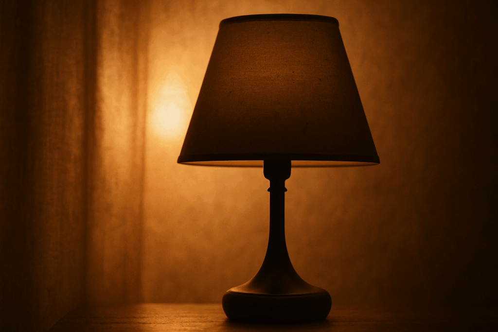
Why Color Pairing is a Game Changer in 2026
Selecting the right color palette in interior design is more than an aesthetic choice it’s a strategic tool with the power to shape how a space feels, functions, and is perceived. Whether you’re redesigning a studio apartment or refreshing a family home, your color combinations can drastically shift the atmosphere.
The Power of Color in a Room
Well paired colors influence more than just visual appeal they can:
Affect mood: Warm tones bring energy, while cool tones introduce calm.
Shape perception: Light shades can make small rooms feel larger; dark hues can cozy up larger spaces.
Guide function: Specific pairings can help define how a room is used relaxation, focus, or socializing.
What’s Shifting in 2026
Design thinking in 2026 leans more into emotional resonance and flexible functionality. The way we choose and combine colors is increasingly informed by personal well being and sustainability.
Key changes to note:
Color psychology is personalizing. Instead of one size fits all rules, designers are embracing emotion informed palettes that reflect individual lifestyles.
Neutrals are evolving. Today’s neutrals include dusty tones, soft blushes, and muted earth colors not just beige and gray.
Nature inspired tones dominate. Palettes drawn from the outdoors greens, browns, and sky inspired blues are the new cornerstone of calming interiors.
Contrast with purpose. High contrast pairings are being used subtly to delineate function within open spaces without the need for walls.
In short, color in 2026 isn’t just about prettifying a room it’s about curating an experience that supports how you live, work, and rest.
Sage Green + Terracotta
This pairing nails balance without trying too hard. Sage green brings in calm, grounded energy think forests, herbs, and open air. Terracotta counters with quiet warmth, making the space feel lived in, not staged. Together, they strike a visual rhythm that’s fresh but deeply familiar.
It works especially well in spaces meant for creativity or connection. Living rooms feel more relaxed, and home studios gain just enough color to stay inspiring without cluttering the mind. If you’re working these colors into a room, lean on materials that echo the mood: wood with some texture, soft linens, maybe a touch of muted brass for an old soul accent.
There’s nothing flashy about this palette but that’s exactly the point. It’s solid, grounded, and quietly confident just like the best interiors.
Navy Blue + Soft Blush
This combo walks a fine line between bold and gentle, and that’s its strength. Navy brings the weight a cool, classic tone that stabilizes a space while soft blush lightens the mood just enough to keep things from feeling heavy. It’s unexpected, but it works because the contrast is clean, not chaotic.
Use this pair in bedrooms where you want calm with a touch of drama. It’s also great for transitional areas hallways, foyers, side rooms where design still matters but space is limited. Navy adds quiet depth, blush brings warmth, and together they don’t overpower. Think of it as confidence with a whisper.
The key here is balance in coverage. Let one color lead and the other support. Paint the wall navy, and bring in blush through linens or art or flip it. Either way, you get a look that’s elevated without being fussy.
Charcoal + Mustard Yellow

This pairing walks the line between edgy and energetic, making it a power combo for spaces that get a lot of foot traffic think hallways, kitchens, or open plan living areas. Charcoal brings the weight, grounding the space with a sense of structure and calm. Mustard adds the punch. It’s bold, a little vintage, and surprisingly versatile when balanced right.
To keep the look sharp, stick with finishes that echo that same contrast. Matte black fixtures lean into the charcoal’s depth without getting too glossy or loud. On the other hand, oak accents introduce just enough warmth and organic texture to make everything feel intentional, not sterile. It’s a modern, mature take that still has personality. No fluff, no flash just two colors doing serious work.
Dusty Lavender + Warm Neutrals
This duo has quickly become a 2026 favorite, especially among those leaning into minimalist aesthetics.
Why It Works
Subtle elegance: Dusty lavender introduces a soft, serene hue without overpowering a space.
Grounding balance: Warm neutrals like beige, taupe, or greige create a clean, functional backdrop.
Light enhancing: Both shades reflect light gently, making rooms feel more open and calm.
Ideal Spaces
Looking to elevate a quiet corner or boost focus in your home? This color combination is especially effective in:
Home offices: Offers a soothing ambiance, perfect for focus and productivity.
Reading nooks: Adds gentle character without distraction.
Styling Tips
Pair with natural textures like rattan, linen, or reclaimed wood.
Use matte finishes or soft textiles to maintain a cohesive and grounded feel.
Incorporate minimalist lighting fixtures to enhance the clean aesthetic.
This pairing proves that personality and tranquility can coexist making it the go to for calm, creatively driven spaces.
Forest Green + Creamy White
This pairing works because it feels alive without overwhelming the senses. Forest green brings depth and grounded calm, while creamy white keeps things bright and open. Together, they lean into biophilic design connecting your space to nature subtly and stylishly.
Use this combo in places where you want clarity and warmth to coexist. Kitchens, especially those with good natural light, benefit from the freshness of creamy white. Add forest green cabinetry or seating to ground the look. Open plan dining areas also shine with this mix, giving structure without feeling boxed in.
It’s quiet, confident, and easy to live with. No loud statements just an environment that feels intentional and connected.
Burnt Orange + Cool Gray
This pairing does something few color combos manage it’s both loud and restrained. Burnt orange carries heat and charisma, while cool gray lowers the volume just enough to make it livable. Together, they hit a sweet spot: vibrant without feeling loud, neutral without being dull.
Burnt orange is bold, so use it where it counts an accent wall, a statement chair, or a textured rug with personality. Gray does the heavy lifting in the background, anchoring the energy and keeping the palette grounded.
What seals the deal? This duo leans into retro modern style without going full time capsule. Think mid century meets minimalism. A little moody, a little warm, totally fresh.
Classic Black + Soft Taupe
A high contrast combination that never goes out of style, Classic Black and Soft Taupe offers a timeless elegance suited for a range of interior aesthetics. This pairing strikes a balance between boldness and subtlety, allowing you to highlight architectural features or create refined focal points.
Why It Works
Timeless Appeal: Black adds dramatic contrast while taupe softens the palette for an approachable yet upscale feel.
Design Flexibility: Whether you’re aiming for a traditional backdrop or a contemporary edge, this duo integrates seamlessly.
Textural Impact: Matte black finishes and stone textured taupes elevate the look further, offering both visual and tactile depth.
Where to Use It
This versatile palette finds its stride in a variety of interiors:
Entryways: Make a statement as soon as someone walks in, using black for doors or paneling and taupe for walls.
Bathrooms: Achieve a spa like atmosphere with taupe tiles and black fixtures.
Sleek Kitchens: Combine black cabinetry with taupe backsplash or countertops for a modern yet grounded feel.
Whether you’re favoring rich contrasts or soothing transitions, Classic Black + Soft Taupe makes it easy to marry function with unmistakable style.
Making the Most of Color in Small Spaces
When you’re working with limited square footage, color becomes a strategic tool not just decoration. Choosing the right color combinations can visually stretch room dimensions without knocking down a single wall.
Stick to lighter tones if your goal is to make a space feel larger. Colors like creamy whites, soft blushes, and warm neutrals reflect more light, creating an airy atmosphere. That said, pairing a light wall color with a darker but complementary tone like forest green or charcoal on key accents can add depth and prevent the space from feeling flat. The key is contrast with restraint.
Use vertical color blocking to trick the eye upward. Painting partial walls or adding tall, tonal shelves helps elongate the height of a room. Glossy or satin finishes bounce more light and can be especially useful in corners or backsplashes where natural light is limited.
Lighting matters just as much as paint. Even the best palette will underdeliver in poor lighting. Use layered lighting overhead, task, and ambient to support the tone of the room throughout the day.
And when in doubt, go minimal. A simple color combo executed well beats a complicated palette every time. Want more tactics? Check out Maximizing Vertical Space in Studio Apartments for layout tips that work hand in hand with smart color choices.
Key Takeaway: Less Guesswork, More Cohesion
Trends fade. Lifestyle sticks. That’s the mindset smart homeowners are adopting in 2026 when choosing color palettes. Instead of copying whatever shade is trending on design blogs, more people are building room concepts around how they actually live who’s using the space, when, and for what.
A bold rust orange might look great online, but clash with your daily mood or mess with your lighting. That’s why swatches and mood boards aren’t optional they’re your first test drive. Tape up some samples. Build a palette that moves with your space, not against it.
In a year where renovations are more expensive and time consuming than ever, dialing in intentional color is the fastest, cleanest way to transform a room. Small changes, big difference. What matters is choosing colors that do something ground your day, soften a space, or energize a corner. Think long term, not likes.
 There is a specific skill involved in explaining something clearly — one that is completely separate from actually knowing the subject. Malric Yelthorne has both. They has spent years working with home design inspirations in a hands-on capacity, and an equal amount of time figuring out how to translate that experience into writing that people with different backgrounds can actually absorb and use.
Malric tends to approach complex subjects — Home Design Inspirations, Gardening and Landscaping Advice, DIY Projects and Ideas being good examples — by starting with what the reader already knows, then building outward from there rather than dropping them in the deep end. It sounds like a small thing. In practice it makes a significant difference in whether someone finishes the article or abandons it halfway through. They is also good at knowing when to stop — a surprisingly underrated skill. Some writers bury useful information under so many caveats and qualifications that the point disappears. Malric knows where the point is and gets there without too many detours.
The practical effect of all this is that people who read Malric's work tend to come away actually capable of doing something with it. Not just vaguely informed — actually capable. For a writer working in home design inspirations, that is probably the best possible outcome, and it's the standard Malric holds they's own work to.
There is a specific skill involved in explaining something clearly — one that is completely separate from actually knowing the subject. Malric Yelthorne has both. They has spent years working with home design inspirations in a hands-on capacity, and an equal amount of time figuring out how to translate that experience into writing that people with different backgrounds can actually absorb and use.
Malric tends to approach complex subjects — Home Design Inspirations, Gardening and Landscaping Advice, DIY Projects and Ideas being good examples — by starting with what the reader already knows, then building outward from there rather than dropping them in the deep end. It sounds like a small thing. In practice it makes a significant difference in whether someone finishes the article or abandons it halfway through. They is also good at knowing when to stop — a surprisingly underrated skill. Some writers bury useful information under so many caveats and qualifications that the point disappears. Malric knows where the point is and gets there without too many detours.
The practical effect of all this is that people who read Malric's work tend to come away actually capable of doing something with it. Not just vaguely informed — actually capable. For a writer working in home design inspirations, that is probably the best possible outcome, and it's the standard Malric holds they's own work to.