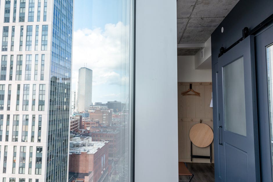
Neutrals with a Twist
If your space feels cramped or chaotic, start here. Soft whites and earthy taupes create a calming, stripped down palette that lets your furniture and lighting do the talking. These tones reflect natural light, open up tight rooms, and give your eyes somewhere to rest. It’s minimalism without the cold sterility.
But don’t let it go flat. This combo needs contrast enter black accents. Think matte black curtain rods, light fixtures, or a single dark coffee table. They break up the softness just enough to add structure and intentionality.
This look thrives in smaller homes and city apartments. It works because it’s grounded, not boring. Clean, considered, and quietly elevated.
Explore more apartment setup ideas
Bold Pairings That Actually Work
When done right, bold color combos can make a space feel curated not chaotic. Navy blue paired with mustard yellow walks the line between classic and edgy. It adds punch without going overboard. Think statement sofa in mustard, a navy accent wall, or navy cabinetry offset by gold toned hardware. It’s a modern move that still feels grounded.
On the flip side, forest green with blush pink leans more refined. It’s a softer contrast, but no less impactful. Picture blush textiles throw pillows, curtains against deep green walls or a velvet armchair. It’s the kind of pairing that makes people look twice, and adds a layer of unexpected detail to the space.
One thing both combos share: they demand restraint. The key is balance. Anchor them with neutrals white walls, wood flooring, or beige upholstery to keep the scene from feeling too loud. A bold color moment should elevate, not overwhelm.
Monochrome Done Right

Tonal doesn’t mean boring. Sticking to a single color family think warm whites, layered beiges, or soft grays creates a quiet kind of luxury. It’s a move that feels intentional, not empty. But the trick is in the texture. Smooth linen, rough wood, matte metal these materials play off of each other and give the space dimension.
When the palette is subdued, you’ve got more room to play with contrast in other ways. Natural light bounces differently across finishes. A single rough hewn oak shelf can break up a sea of cream walls. This approach is especially effective in areas where calm matters most living rooms built for recovery, bedrooms meant for deep rest.
It’s not about flashy statements. It’s about creating a space where your eye can breathe.
Earth Inspired Mixes
If you’re chasing warmth without the clutter, this is your lane. Terracotta and olive make a grounded, sun baked combo that instantly calls to mind Mediterranean terraces and slow, outdoor meals. These aren’t just trendy colors they feel lived in and timeless.
Blend that with sand tones, clay accents, and unfinished or lightly stained wood. The result is a palette that’s calm but far from boring. It’s textured, organic, and plays especially well with natural light. Think of it as earth tones done with intention.
This mix slots neatly into design styles like Japandi, rustic minimalism, or anything that leans nature connected. It’s less about high contrast and more about cohesion. The materials matter as much as the hues linen, raw ceramic, stone. It’s a style that doesn’t shout, but it resonates.
High Impact Accent Combos
Deep plum and soft gold aren’t for the faint of heart but they deliver instant elegance. Use them intentionally: a plum velvet headboard, gold accented lighting, or rich drapes can bring drama without overwhelming. Keep surrounding elements grounded think soft grays or off whites so the duo can command the spotlight.
Looking for something cozier with edge? Charcoal and burnt orange hit that sweet spot. They lend warmth and character to creative spaces, especially when layered through textured textiles like woven rugs, boucle throws, or painted accent walls. Think artist loft, not dorm room.
These bold color pairings work best when you commit, but not carelessly. Stick to feature walls, focal furniture pieces, or stand alone décor like oversized art. Let the palette speak loud but not all at once.
Practical Tips for Color Confidence
Start with your paint don’t trust the sample chip alone. Always test colors on the actual wall, and check them in both natural daylight and your evening lighting. What feels warm and creamy in the morning can shift to greenish or dull under artificial light.
When it comes to big ticket pieces like flooring or sofas, keep things neutral. Think soft ash wood, warm grays, or clean whites. This gives you room to play elsewhere without locking yourself into a fixed palette.
Want personality without the long term commitment? Rotate in color through easy to change pieces. Rugs, pillows, and wall art are the quickest way to inject energy or dial it back without a major overhaul. Small moves, big impact.
Need help optimizing small spaces? Check out these apartment setup ideas


 There is a specific skill involved in explaining something clearly — one that is completely separate from actually knowing the subject. Malric Yelthorne has both. They has spent years working with home design inspirations in a hands-on capacity, and an equal amount of time figuring out how to translate that experience into writing that people with different backgrounds can actually absorb and use.
Malric tends to approach complex subjects — Home Design Inspirations, Gardening and Landscaping Advice, DIY Projects and Ideas being good examples — by starting with what the reader already knows, then building outward from there rather than dropping them in the deep end. It sounds like a small thing. In practice it makes a significant difference in whether someone finishes the article or abandons it halfway through. They is also good at knowing when to stop — a surprisingly underrated skill. Some writers bury useful information under so many caveats and qualifications that the point disappears. Malric knows where the point is and gets there without too many detours.
The practical effect of all this is that people who read Malric's work tend to come away actually capable of doing something with it. Not just vaguely informed — actually capable. For a writer working in home design inspirations, that is probably the best possible outcome, and it's the standard Malric holds they's own work to.
